Project name:
CoreLogic Security
Scope of work:
Web Design, Webflow Development
The problem:
Cybersecurity websites often overwhelm users with jargon meant for experts, not buyers. This project simplifies that complexity into clear, trustworthy design while preserving technical credibility.
Wireframes & Copywriting
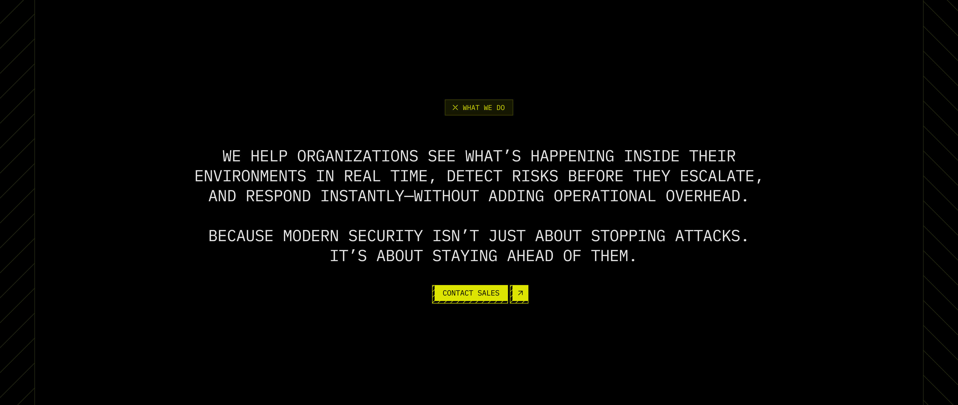
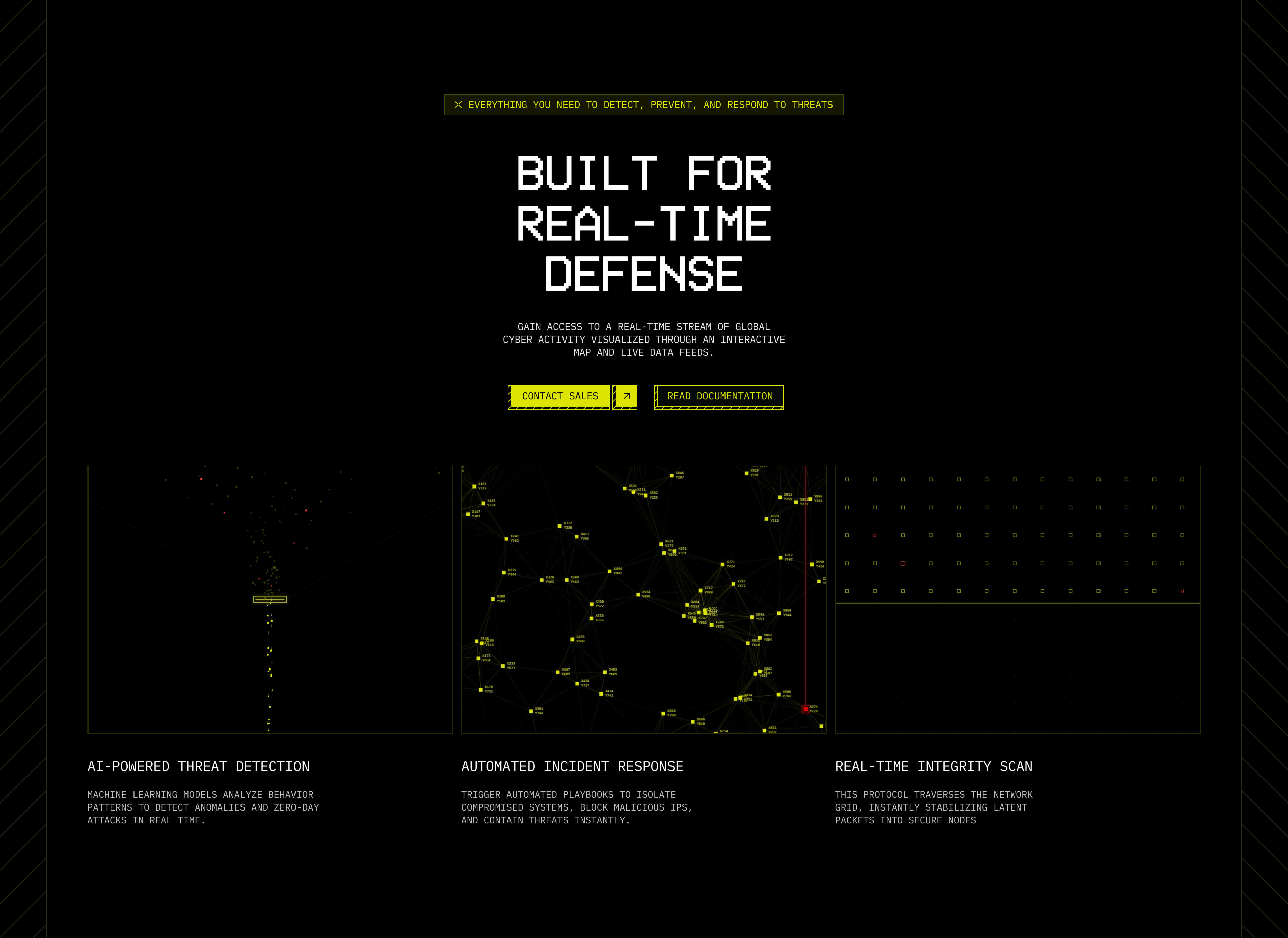
The homepage was designed to alternate between three emotional states.
Confidence
Large statements immediately establish trust. "Cyber threats never sleep. Neither do we. "The goal wasn't to sound aggressive. It was to create reassurance.
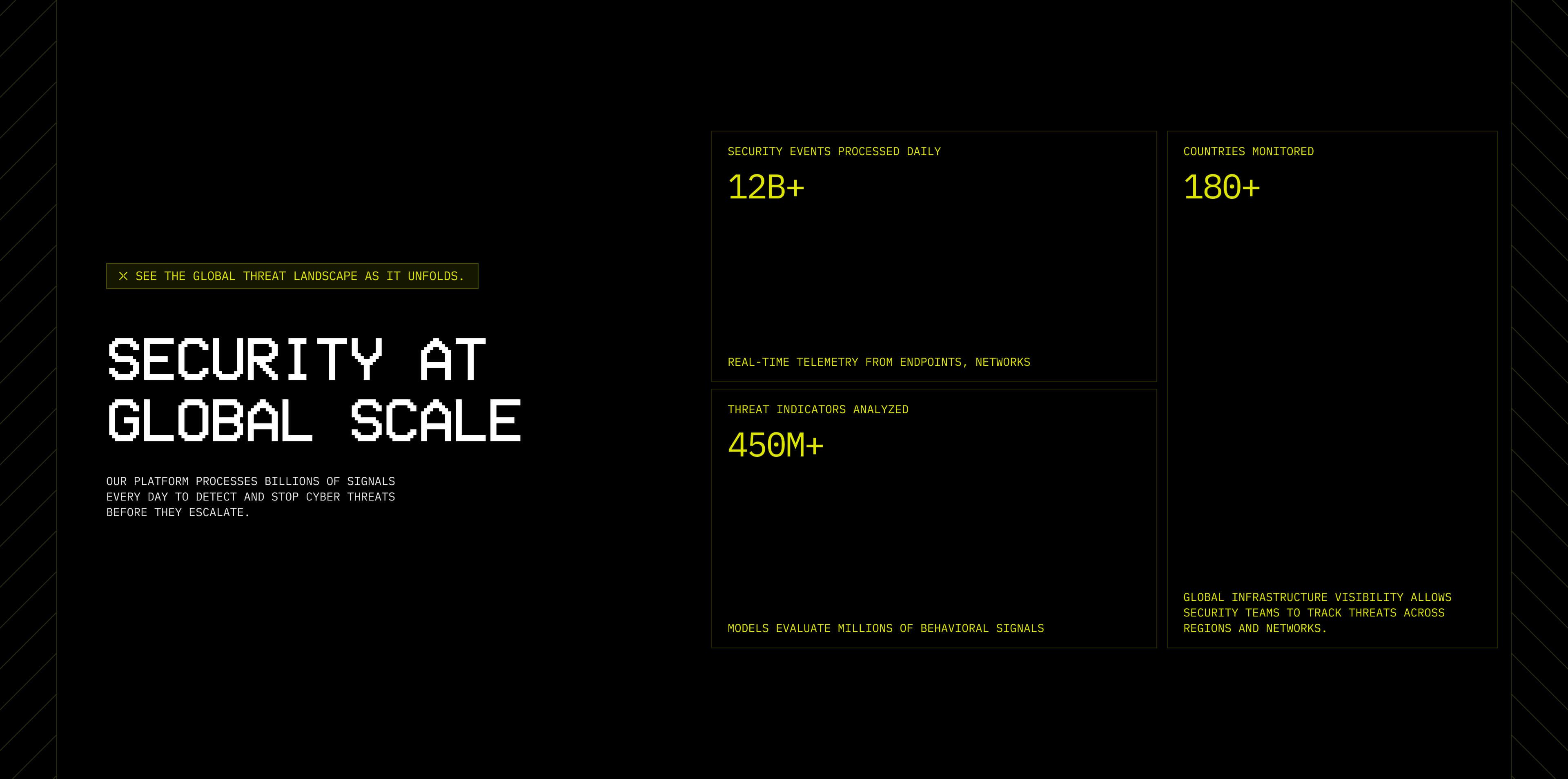
Education
Once trust is established, the website shifts into explaining capabilities. Users learn how AI-powered detection, automated incident response, and global threat monitoring work. This section intentionally avoids overwhelming technical explanations. Instead, it shows in visual way how these features work.
Validation
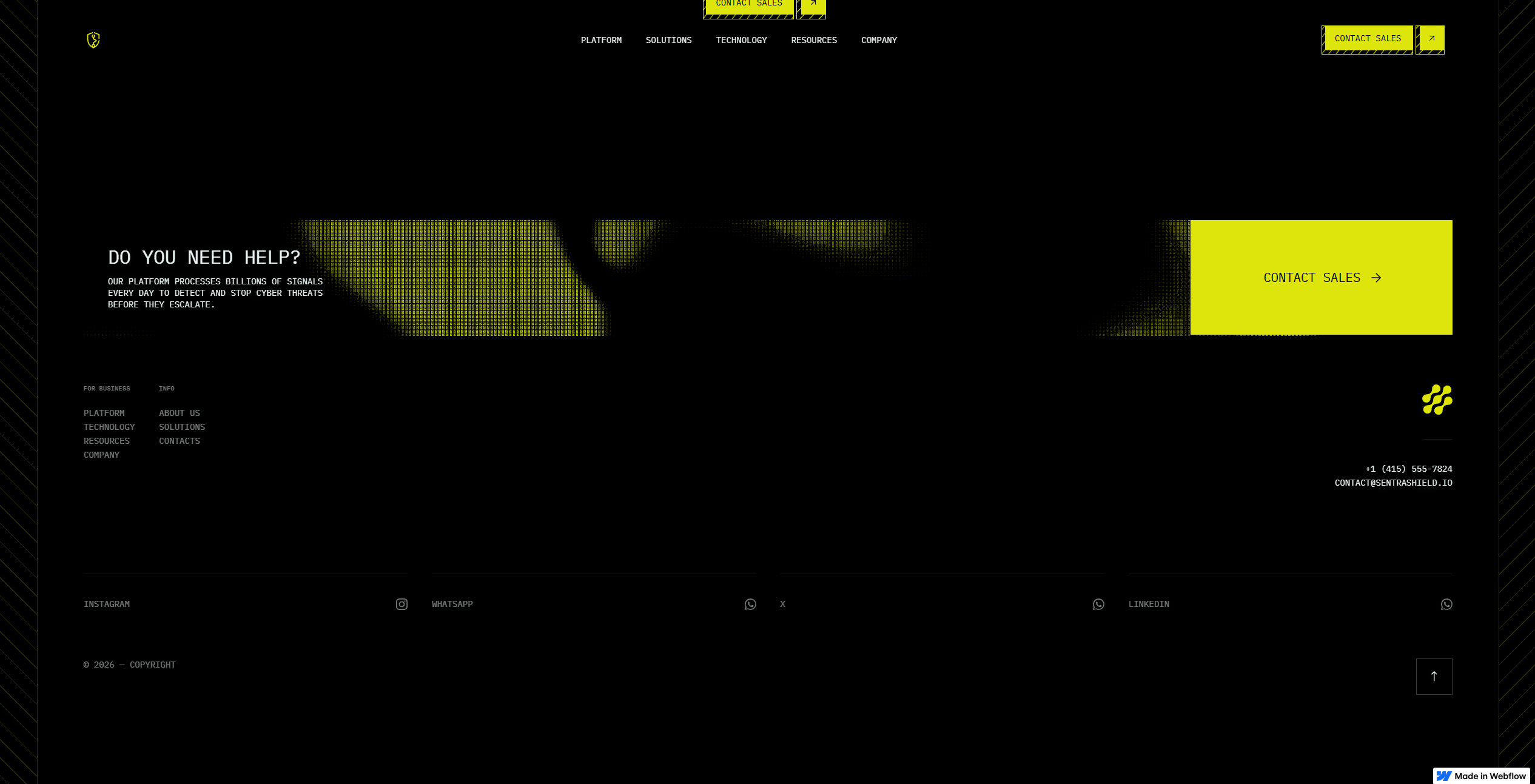
Finally, social proof reinforces credibility. Testimonials, metrics, and CTA to boost conversion rate.
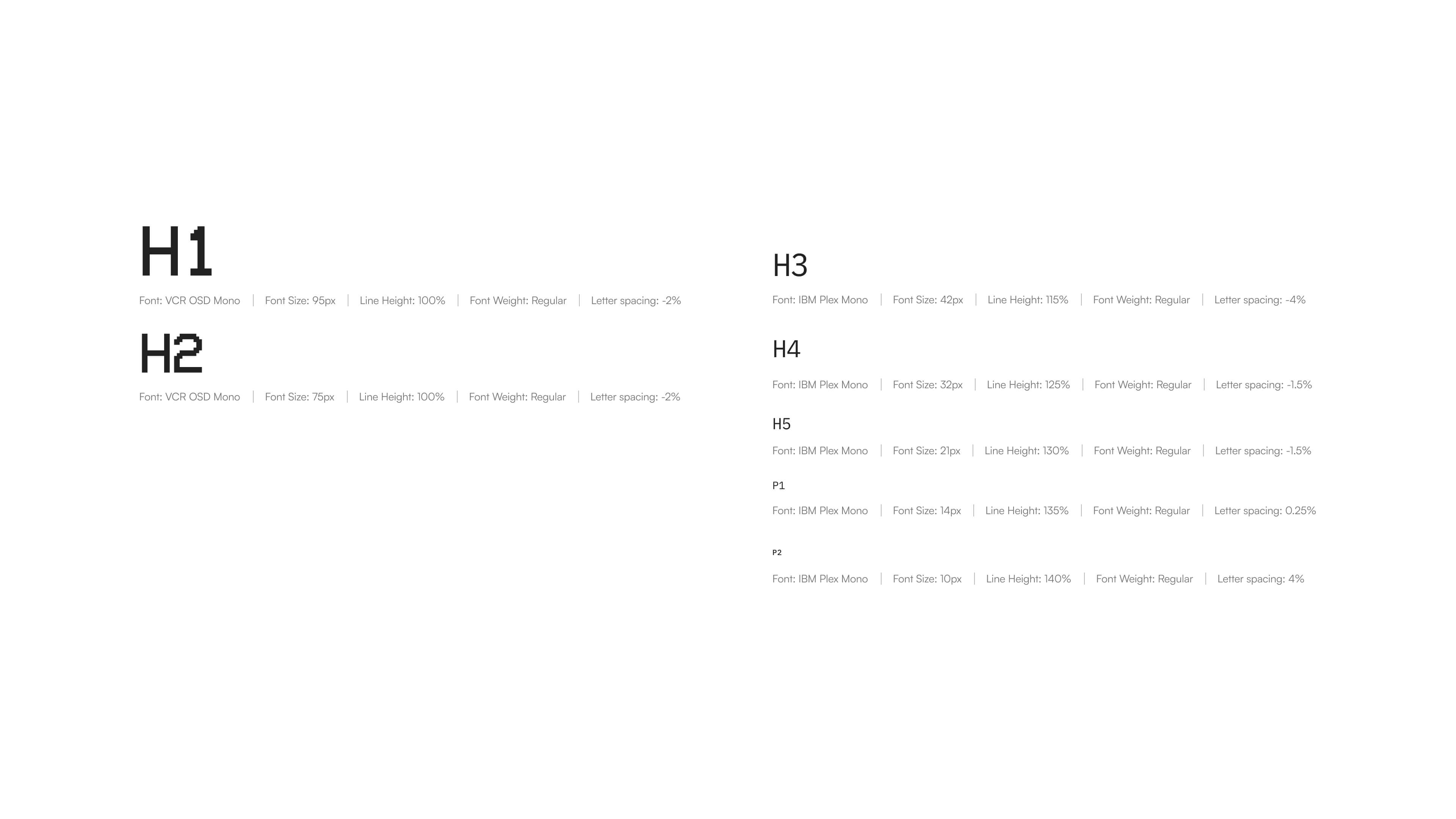
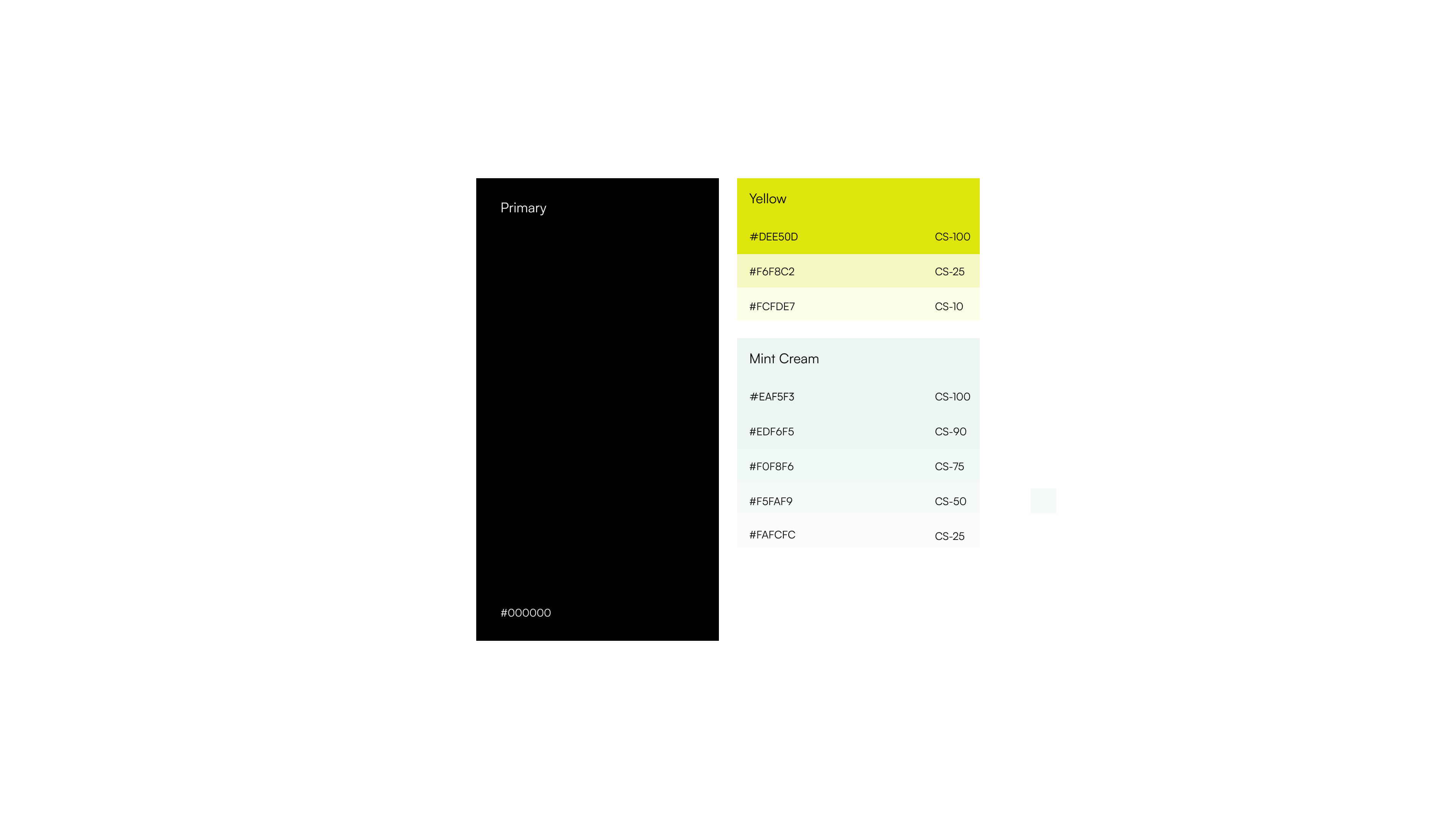
Visual Direction
I wanted to move away from the generic cybersecurity look of blue gradients, shields, and lock icons. Instead, I used a terminal-inspired aesthetic with yellow as the main accent. It references command-line systems and alerts while creating strong contrast on dark backgrounds, resulting in a design that feels like a blend of a futuristic dashboard and a monitoring system
Micro Interactions
This became one of my favorite parts of the project. I wanted movement to feel intentional rather than decorative.
For the feature cards, I built a small AI-assisted tool that helped generate interaction behaviors. Instead of static cards, each component showcase the feature logic and introduces subtle depth throughout the interface.
Using Unicorn Studio allowed me to create animated environments that feel like living infrastructure. The motion stays subtle. Enough to create energy without competing against the content itself.
For the hero section I've used animated SVG's and blob tracking interaction as well as mouse interaction to grab user's attention from the first glance.
These small moments make the platform feel active.
Webflow Development
I rebuilt the entire system inside Webflow. The focus wasn't simply translating Figma into production. It was creating a scalable website architecture.
I encountered issues where the browser’s power-saving mode caused high-fidelity unicorn animations to lag significantly and it took a lot of time to load them in when the device was unplugged. To ensure a consistently smooth experience, I replaced these heavy animations with optimized background videos specifically for laptop viewports, maintaining the visual impact while drastically improving load times and performance consistency.
The build prioritized:
- Responsive layouts
- Modular sections
- Consistent spacing systems
- Performant interactions
Every section was built with future growth in mind.