Project name:
CoreLogic Security
Scope of work:
Web Design, Webflow Development
The goal:
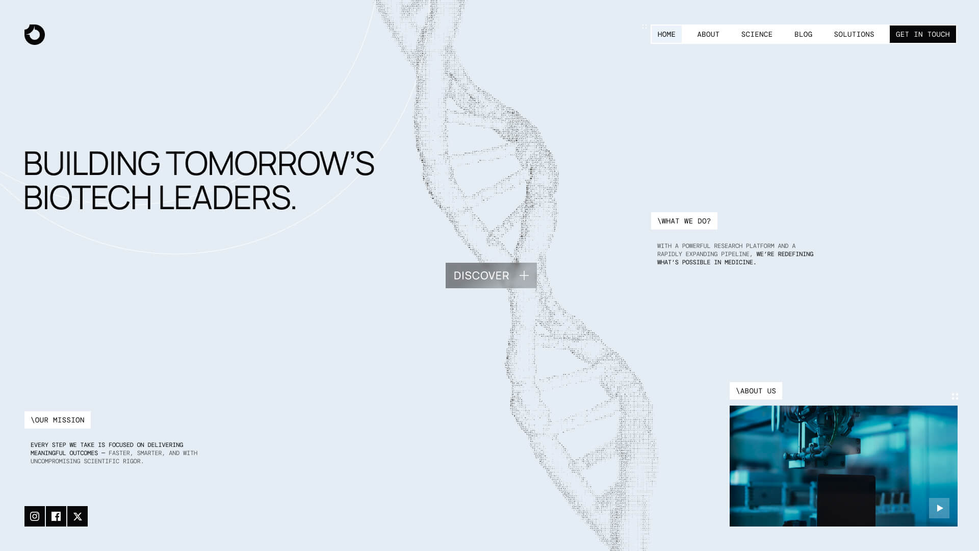
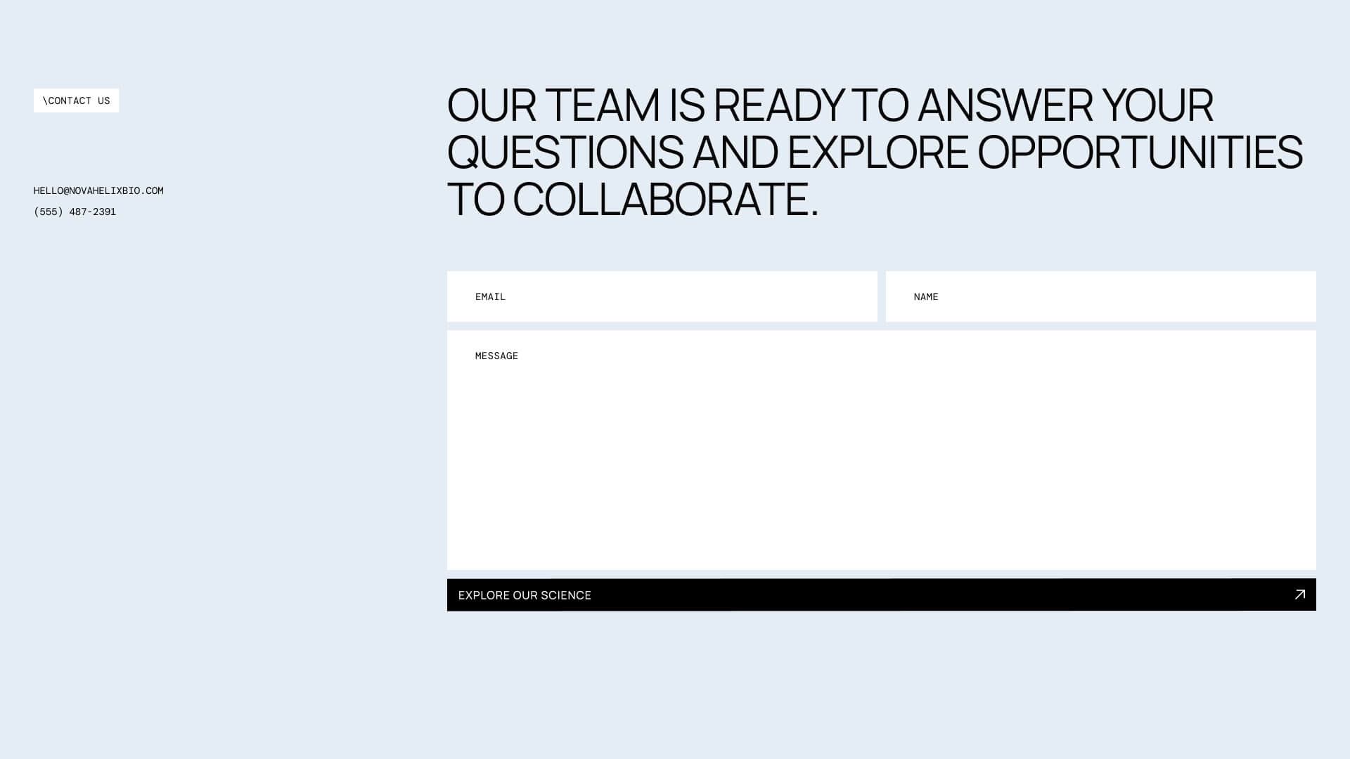
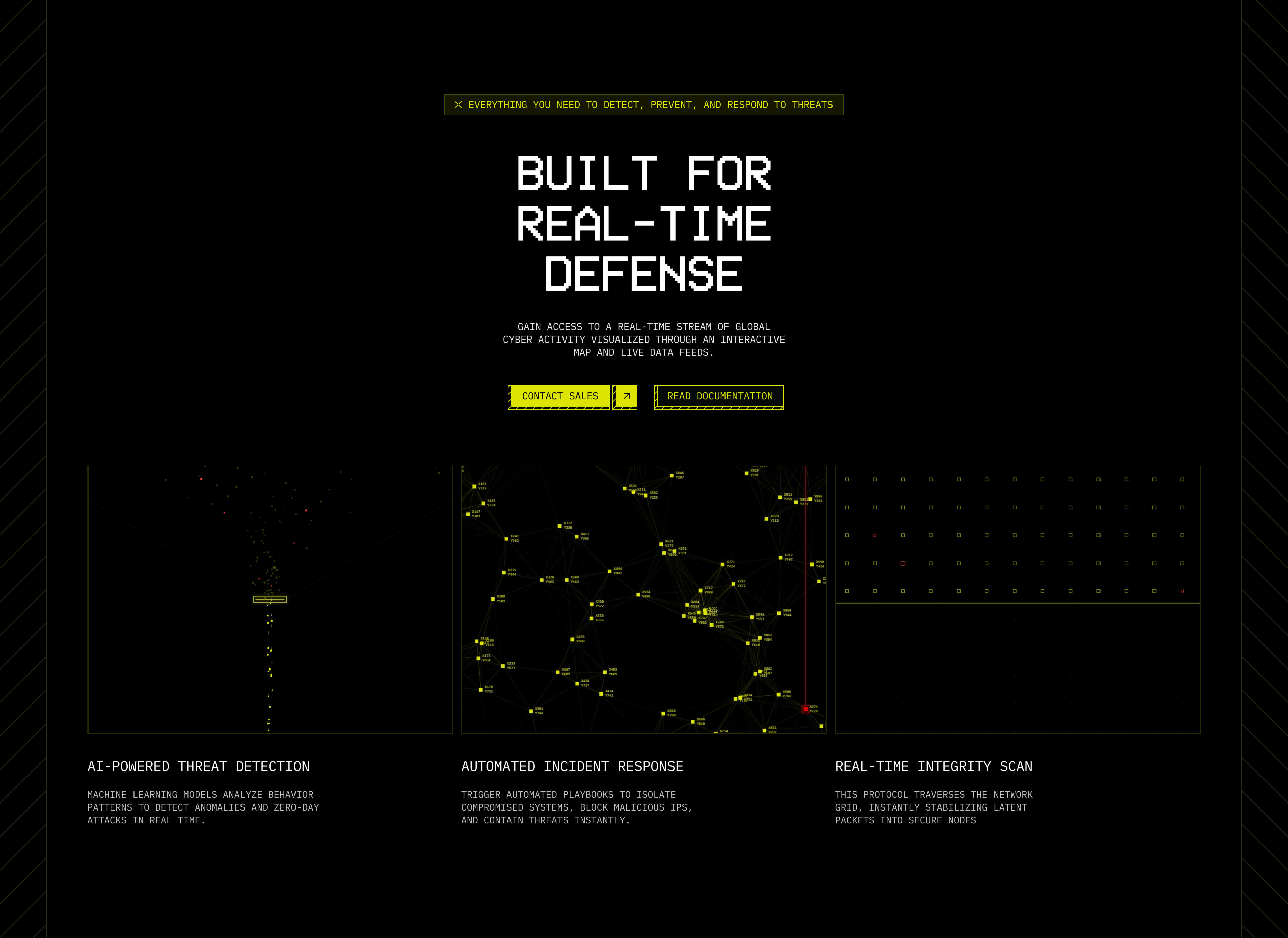
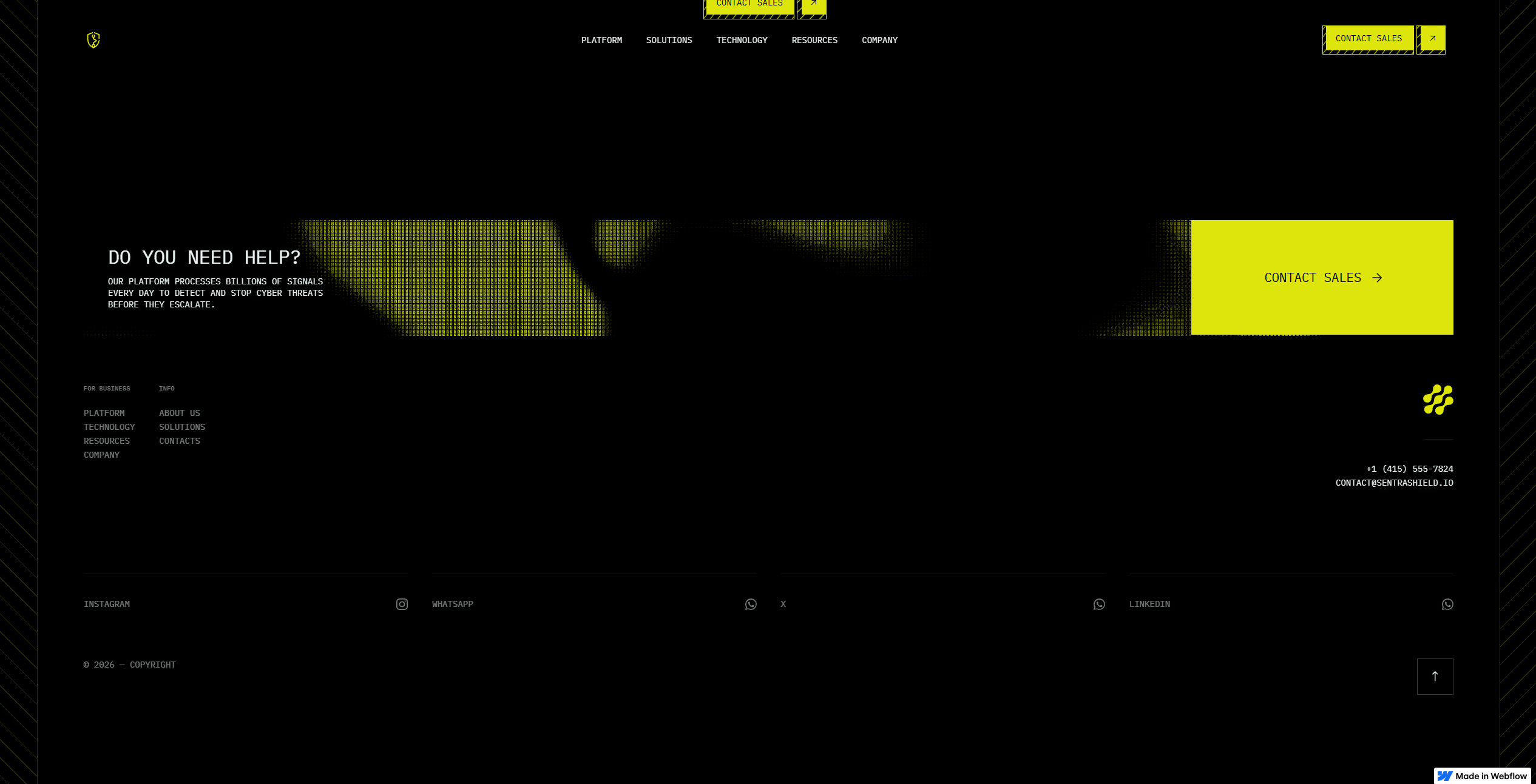
The goal of this project was to create a website that communicates innovation while remaining approachable. Instead of relying on overly clinical visuals, the design combines technical precision with a clean, contemporary aesthetic that allows the research to take center stage.
Establishing the Foundation:
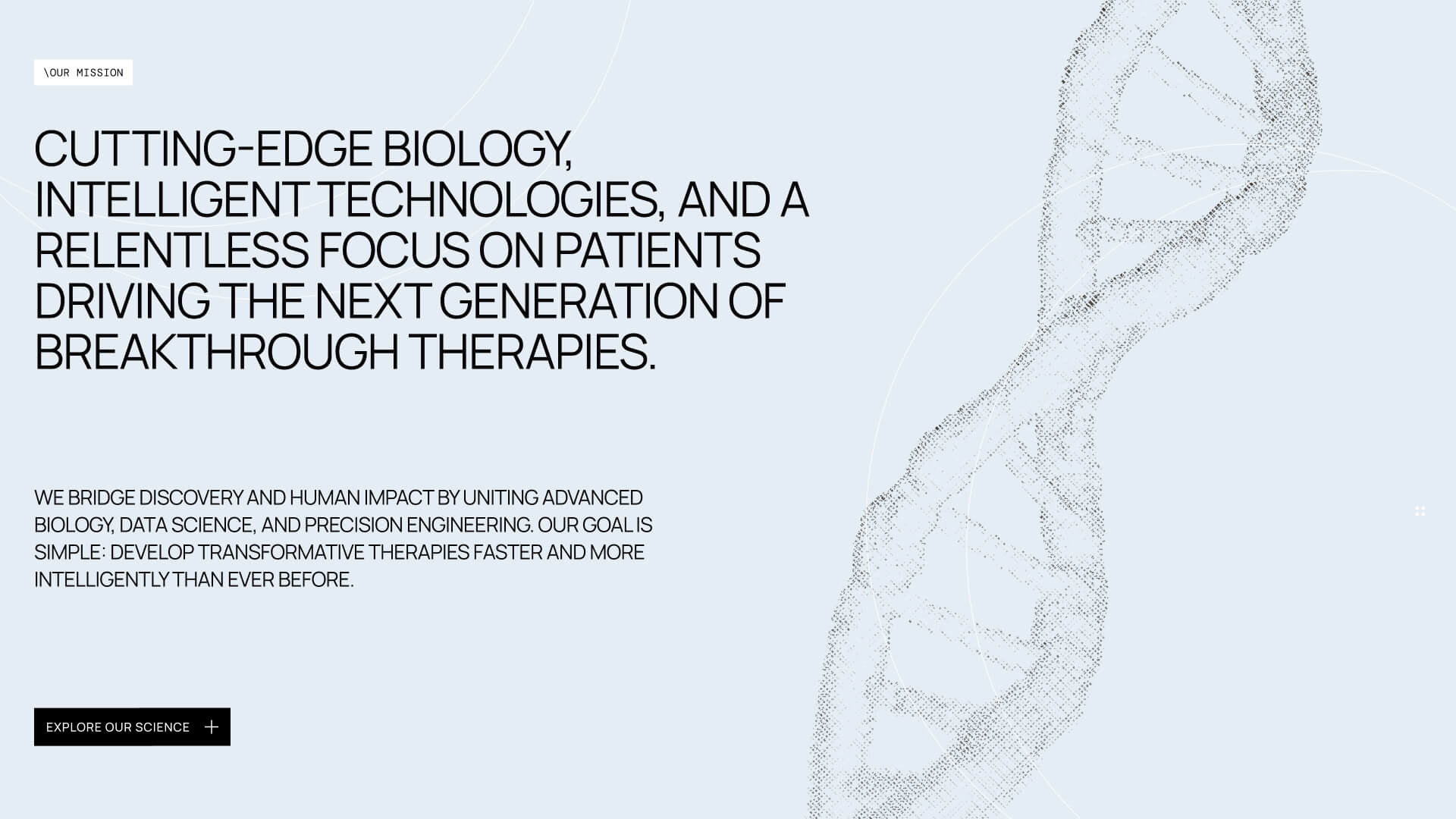
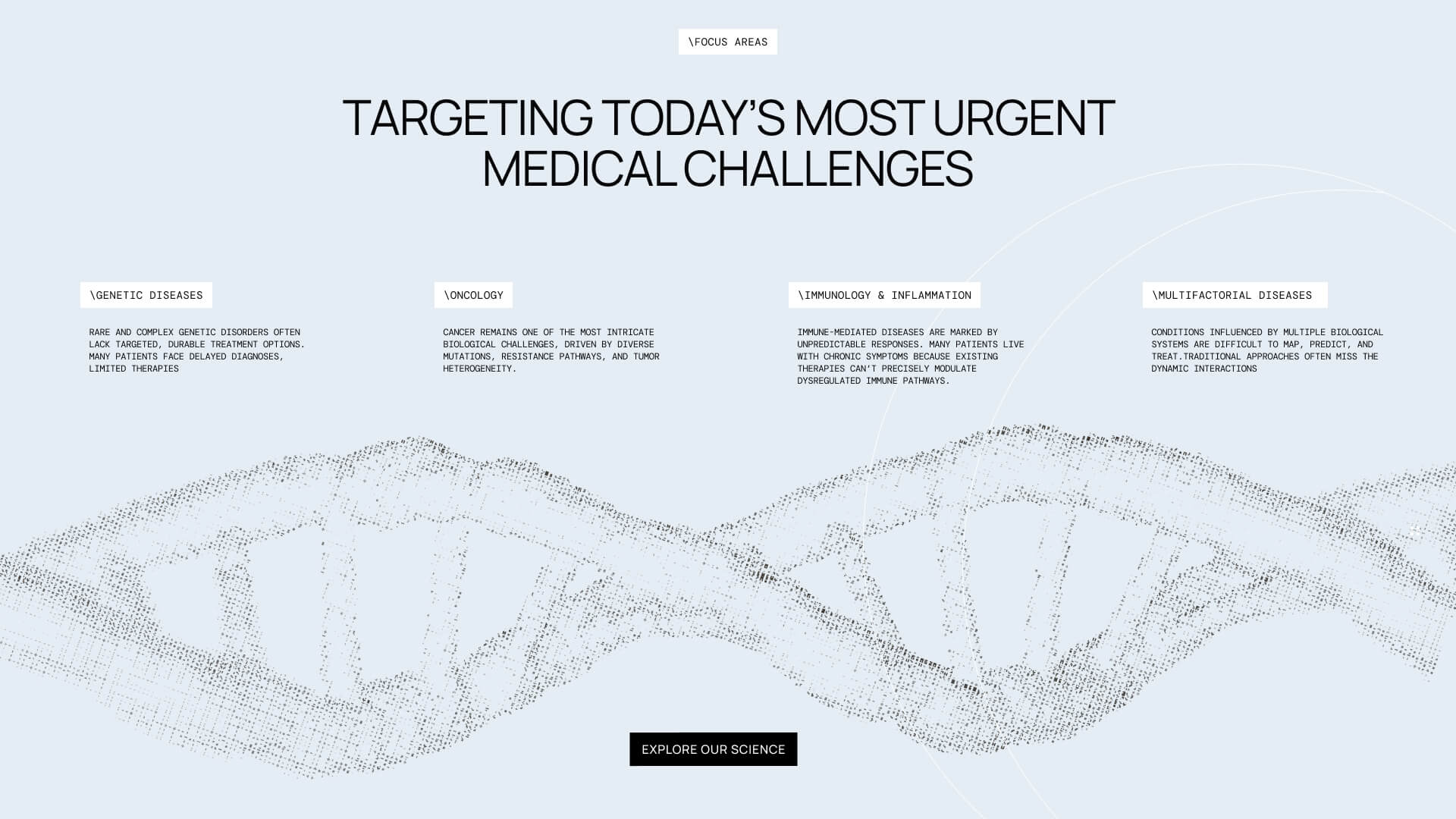
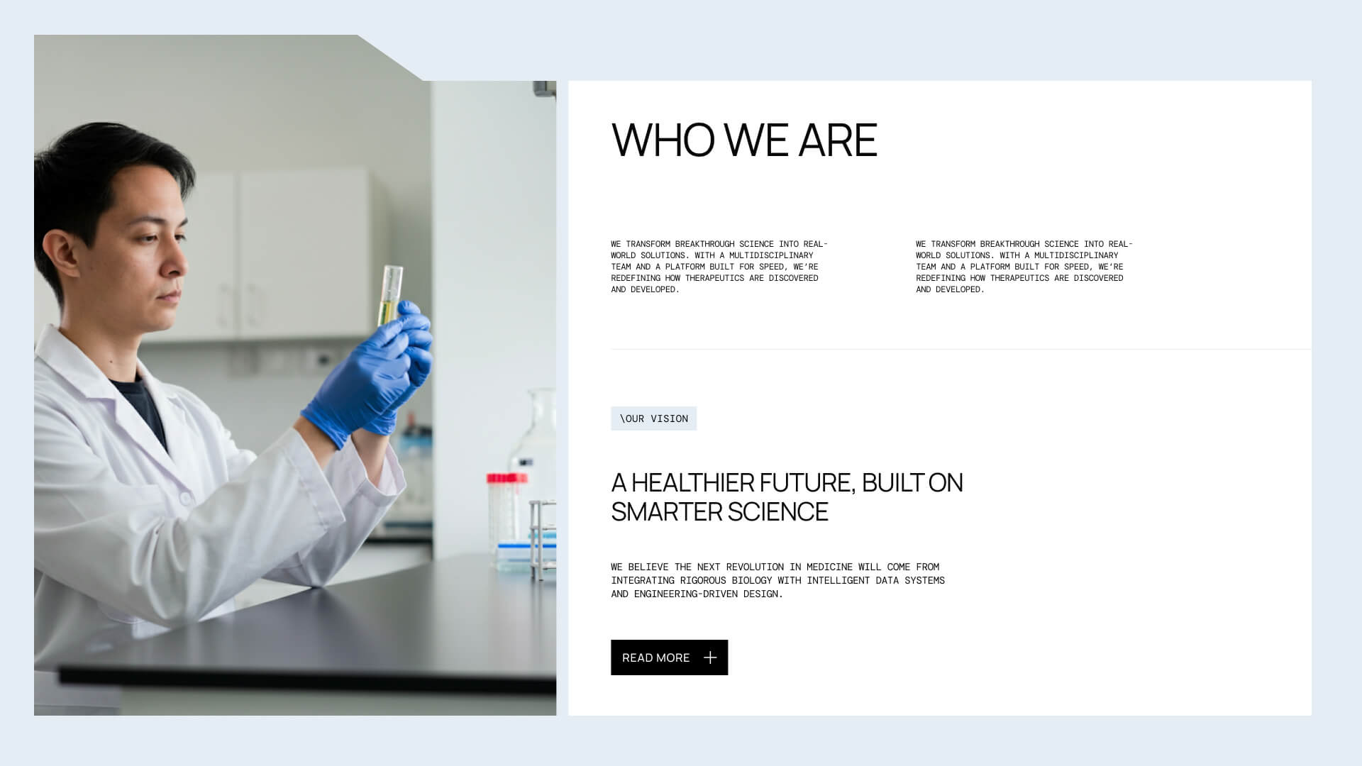
The project began by defining the information hierarchy before exploring visual design. Rather than treating the website as a collection of pages, I approached it as a guided journey through the company's work. Each section introduces another layer of the story from the company's mission to its technology, research, and impact allowing visitors to build understanding naturally as they scroll.
Visual Language:
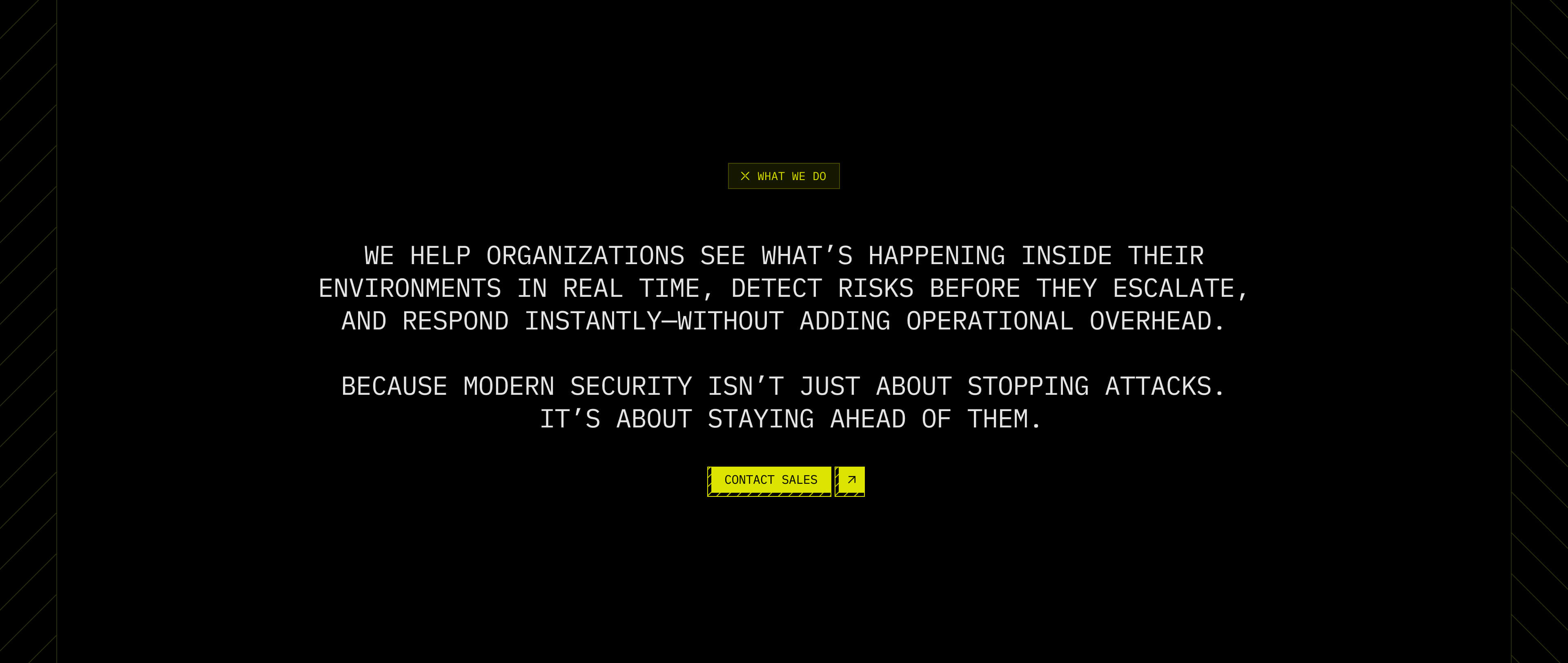
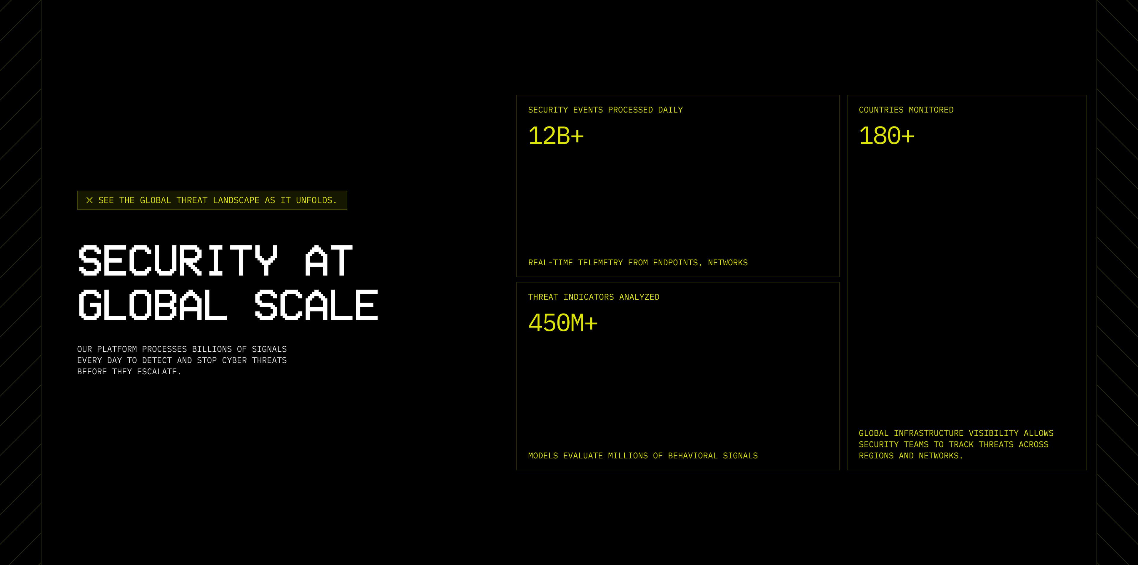
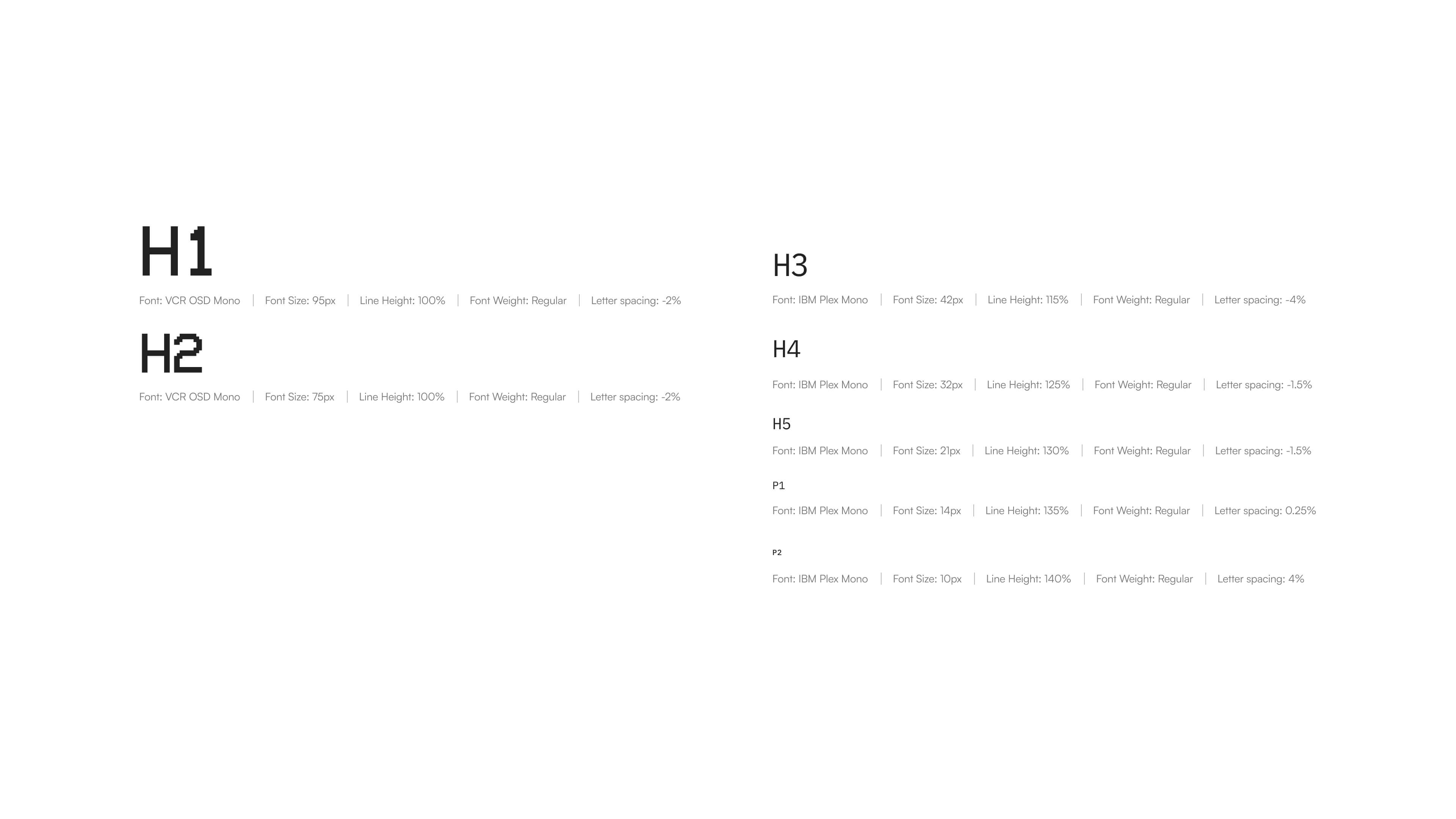
Visually, I wanted the website to feel precise without becoming sterile.
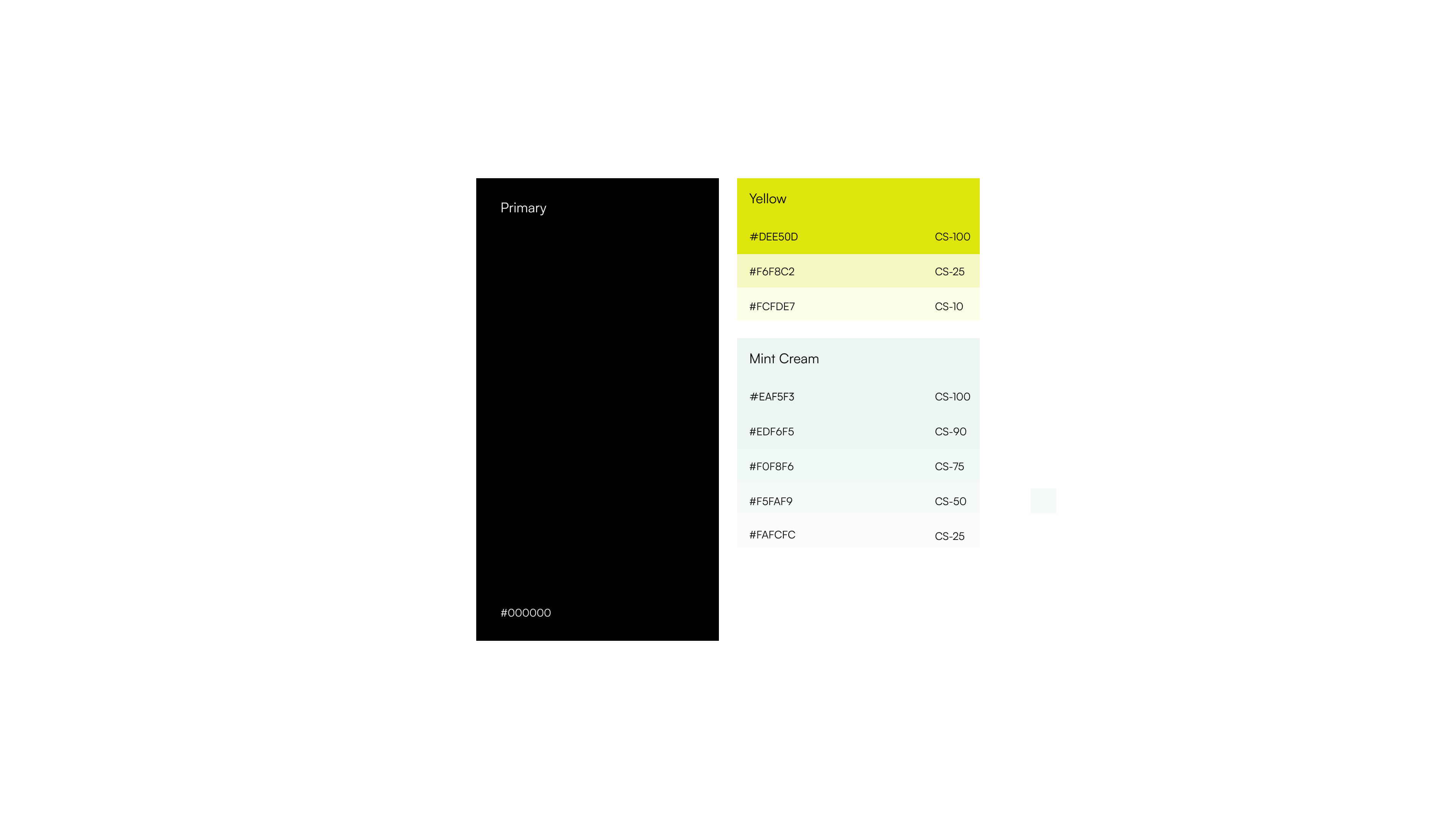
A light color palette creates openness and reinforces ideas of transparency and innovation, while a monospace typeface introduces a subtle technical character inspired by laboratory environments, research documentation, and scientific data.
Micro Interactions
One of the defining aspects of the project is the extensive use of on-scroll animation. Rather than adding movement for visual impact alone, animations became part of the storytelling.
The motion helps guide attention, reinforce hierarchy, and connect individual sections into a single continuous experience. Instead of navigating between isolated pages, visitors move through a narrative that unfolds naturally.
Webflow Development
Once the designs were finalized, the project moved into Webflow, where the focus shifted to translating the scrolling experience into production. Because motion plays such a significant role throughout the website, maintaining smooth performance became a priority.
To create on-scrolling experience I've used gsap, ensuring responsivness and performance on desktop as well as on laptop devices.
During development, I ran into a platform-specific limitation: iOS browsers prevent autoplaying videos in certain scenarios, which would have left visitors with an inconsistent first impression.
To solve this, I implemented a small custom JavaScript solution. Instead of exposing the native play controls, the website initially displays a high-quality poster image of the DNA helix, preserving the intended visual composition. On the user's first interaction anywhere on the page, the script automatically starts the video while keeping the experience seamless by hiding the default play button.
The result is a solution that respects iOS restrictions while maintaining a smooth, polished experience across devices.